What is a PERT chart? And how to use it, with examples
A PERT chart, sometimes called a PERT diagram, is a project management tool used to schedule, organize and coordinate tasks in a project. It provides a graphical representation of a project's events and milestones and the dependencies between them, as well as the project's tasks and their timelines. Project managers can break down each task for further analysis and plan resource allocation.
A PERT chart contains nodes, which are typically drawn as rectangles or circles. The nodes represent the events and milestones that occur throughout the project. The chart also contains vectors, which are drawn as lines that connect the nodes. The vectors represent the tasks that need to be completed as the project is implemented.
PERT charts help project managers estimate the minimum time needed to complete a project. Managers can also analyze the work breakdown and task connections and assess project risks. The breakdown structure makes it easy to organize a complex project with a variety of moving parts by visualizing the dependencies between each step of the process.
PERT stands for program evaluation review technique, a methodology the U.S. Navy developed in the 1950s to manage the Polaris submarine missile program. The critical path method, a similar project management methodology, emerged in the private sector at about the same time.
How a PERT chart works
A PERT chart presents a graphical illustration of a project as a network diagram consisting of numbered nodes linked by labeled vectors. As a visual representation of a milestone or event in the project, each node is displayed as a numbered box or circle that indicates a point at which one or more tasks are started or completed.
Lines (vectors) connect the nodes to show the relationship between the project's tasks and its milestones and events. Each line serves as a visual representation of a task that needs to be completed for the milestone or event to be reached. The line is often accompanied by text that describes the task.
The lines are one-way arrows that show dependencies between nodes and the project's overall workflow. The arrows indicate the direction of the workflow and sequence of connected nodes. Diverging arrows are used when tasks can occur simultaneously.
In Figure 1, for example, the tasks between nodes 1, 2, 4, 8 and 10 must be completed in sequence. These are called dependent or serial tasks. The tasks between nodes 1 and 2 and nodes 1 and 3 do not depend on the completion of one to start the other and can be undertaken simultaneously. These tasks are called parallel or concurrent tasks.
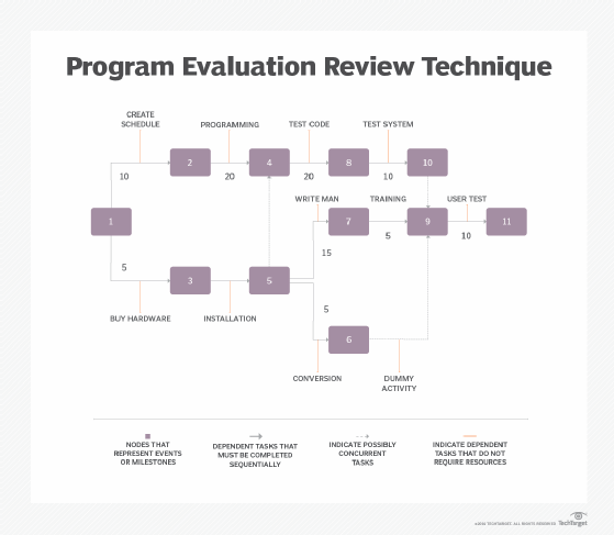
In some cases, a task connects two nodes to create a dependency, but the task does not require time or resources. This type of task is called a dummy activity and is represented by a dotted line. For example, in Figure 1, the dashed arrow linking nodes 6 and 9 indicates that the system files must be converted before the user test can take place; however, the time and resources required to prepare for the user test -- writing the user manual and user training -- are on another path.
The numbers that lie alongside each line indicate the time allotted for that task. The numbers might be in increments of hours, days, weeks or another time period, depending on the project.
A PERT chart also shows the project's critical path, which is the longest -- or most time-consuming -- sequence of dependent tasks. The critical path reflects the minimum time it takes to complete the project. For example, the critical path in Figure 1 is the node sequence 1, 2, 4, 8, 10, 9 and 11. The project cannot be completed any faster than the time it takes to complete these seven tasks.
When working with PERT charts, project managers should also be familiar with these related terms and concepts:
- Fast tracking. When tasks and activities occur simultaneously.
- Predecessor event. An event that occurs immediately before another event.
- Successor event. An event that occurs immediately after another event.
- Slack. The time a single task can be delayed without harming other tasks or the project as a whole.
- Critical path activity. A task that does not experience slack.
- Crashing critical path. When a task's completion time is shortened.
- Lag time. The earliest point at which a task can follow another.
- Lead time. The time it should take to complete a task without impacting activities that follow.
How to create a PERT chart
A PERT chart can be a valuable tool when planning a project, especially a large, complex one. Although project managers take different approaches to creating their PERT charts, they generally incorporate four steps into the process:
- Define all tasks that must be completed.
- Identify all dependencies between the tasks, that is, the order in which those tasks must be performed.
- Draw the nodes that represent the events and milestones, and then draw the vectors that represent the tasks, using arrowed lines to show the sequence and dependencies.
- Identify the completion time for each task.
When determining completion time, project managers often consider three time estimates:
- Optimistic time. Minimum time it takes to complete a task.
- Pessimistic time. Maximum time it takes to finish a task.
- Most likely time. Best guess of how long a task will likely take, assuming no problems arise.
From these estimates, project managers calculate the expected time, which is an estimate of how long it takes to complete a task, taking into consideration any problems or obstacles that might arise. Many project managers use a formula to calculate the expected time:
E=(O+(4×M)+P)/6
In this formula, E is the expected time, O it the optimistic time, M is the most likely time and P is the pessimistic time.
After drawing the PERT chart and estimating the times, the project manager can use the chart for the next steps:
- Find the critical path based on the expected time for each task in the sequence. This path should include the set of consecutive tasks that together take the longest to complete.
- Add together the time it takes to complete each task in the critical path to determine the minimal time it takes to complete the project.
- After the project starts, use the PERT chart to adjust the times if circumstances change or to ensure the project is finished by its designated deadline.
When to use a PERT chart
PERT charts help when a project manager needs to do the following:
- Determine the project's critical path and ensure all deadlines are met.
- Display dependencies between tasks in a sequence.
- Estimate the time needed to complete the project.
- Plan a large and complex project.
Project managers get the best results from their PERT charts when they create them at the beginning of their projects. Doing so helps ensure that a project is accurately scoped, which can preclude potential bottlenecks during the project's execution.
Advantages of PERT charts
PERT charts offer several benefits:
- The PERT technique makes it easier to estimate the time and resources needed for a project by determining what assets are required for each task.
- A PERT chart identifies which tasks must be completed. This information can then be used to identify which teams are responsible for which tasks, facilitating greater clarity and accountability.
- PERT charts are useful in what-if analyses because they can make it easier for stakeholders to evaluate multiple workflows and choose the most efficient, beneficial path.
- A project manager can more easily communicate a project's complexity to key stakeholders with a PERT chart so they can better understand the scope of the project and make more informed decisions about the project's goals.
- PERT charts make deadlines more predictable because they clarify dependencies between tasks and establish a clear order for completing tasks.
Disadvantages of PERT charts
Although PERT charts are broadly beneficial, they can come with certain challenges:
- If managers focus strictly on the deadlines, they might fail to see the full financial implications of the project.
- It isn't easy to revise PERT charts if a project manager decides to make small changes in the project plan to address a roadblock.
- If any calculations made in creating the chart are inaccurate, delays could occur, causing bottlenecks and jeopardizing the final delivery date.
- PERT charts rely on human expertise; their success depends largely on the project manager's experience and knowledge of the specific work the project entails. When that experience or knowledge is insufficient, some charts may include unreliable data or unrealistic expectations for the project's cost and time frame.
- Creating a PERT chart is labor-intensive, requiring significant time and resources. It must also be continuously reviewed and maintained to remain viable.
PERT chart vs. Gantt chart
The PERT chart is often compared to the Gantt chart, another popular visual tool for project managers.
Both PERT and Gantt charts help simplify the project management process through a breakdown structure that divides the project into smaller tasks and identifies any constraints, enabling managers to increase efficiencies and view the project holistically. Both charts help identify dependencies and can improve time management.
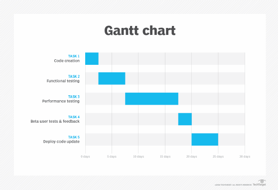
PERT charts are best used before a project begins to plan and estimate how long each task will take. Gantt charts are best used while a project is running. Throughout their projects, managers use Gantt charts to schedule tasks by date and visualize the amount of completed work. In a Gantt chart, each task is represented by a long bar that connects the starting point of the task to its end date.
Some managers prefer a PERT chart to a Gantt chart because it clearly illustrates task dependencies. However, the PERT chart can be more difficult to interpret, especially on complex projects. Project managers often use both techniques so they have a more complete picture of a project and its progress.
There are many ways charts can help visualize work in progress in project management. Learn how Agile teams use Gantt, PERT, burn down and other charts to stay on track.