What is a data flow diagram (DDF)?
A data flow diagram (DFD) is a graphical or visual representation that uses a standardized set of symbols and notations to describe a business's operations through data movement. They're often elements of a formal methodology, such as Structured Systems Analysis and Design Method (SSADM). Superficially, DFDs can resemble flow charts or Unified Modeling Language (UML), but they aren't meant to represent details of software logic.
How are data flow diagrams used?
DFDs make it easy to depict the business requirements of applications by representing the sequence of process steps and flow of information using a graphical representation or visual representation rather than a textual description. When used through an entire development process, they first document the results of business analysis. They then refine the representation to show how information moves through and is changed by application flows. Both automated and manual processes are represented.
How long have data flow diagrams been around?
DFDs debuted in software engineering in the late '70s, making them a precursor to UMLs. DFDs were popularized by the book Structured Design, written by computer professionals Larry Constantine and Ed Yourdon, which was in turn inspired by the data flow graph computation models of David Martin and Gerald Estrin of the University of California, Los Angeles. The idea of structured design led to a major paradigm shift in software engineering -- object-oriented design -- which is still prevalent today. The symbols and notations that became the standard in DFD methodology were contributed by computing experts Tom DeMarco, Chris Gane and Trish Sarson.
Those early DFDs led to a renaissance, not only in software engineering, but in software development and business processes. Diagramming the flow of data through a data processing system helped to clarify the flow of data through business processes themselves -- identifying available data stores, defining workflows and tying system design to the processes the systems were accommodating.
What is the difference between a logical DFD and a physical DFD?
Logical DFDs represent logical information flows in relatively abstract terms. This means that they will identify general processes, systems and activities but not provide technology details. Physical DFDs show more physical information flow detail, particularly details of information systems, applications and databases. They also often have more elements to better depict what information is flowing, what actions are being taken on or with the data, and the resources associated with those actions.
There are many interpretations of logical and physical with respect to DFDs. Enterprise architects and line organizations tend to use logical DFDs and often show fewer details on physical DFDs. Development teams have the opposite orientation and tend to more often use physical over logical DFDs.
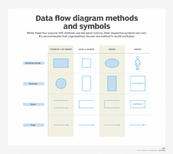
What symbols and notations are used in DFDs?
DFD notions and symbols vary according to the methodology model employed. Some organizations have adopted their own conventions, though this isn't recommended.
Different DFD notations include the following:
- Gane and Sarson.
- Yourdon and DeMarco.
- SSADM.
- UML, which is commonly used to map software architecture but can be used in DFDs.
All DFD notions represent the following:
- External entities. Information enters from or exits the system being described.
- Flows. Define the movement of information to, from and within the system being described.
- Stores. Places where information is maintained or held, most often databases or database tables.
- Processes. Transform information.
Different DFD methodologies use different symbol conventions. The differences and symbol rules are divergent enough to make it difficult for technologists to read the DFDs of methodologies they aren't familiar with.
For example, in the Gane and Sarson notation, entities are boxes with square corners and processes have rounded corners. However, in the Yourdon and DeMarco methodology, entities have square corners, but processes are circles. The SSADM methodology almost reverses the Gane and Sarson convention. Stores in Yourdon and De Marco are shown as parallel lines, but all the other methodologies use a different representation. For this reason, it's important for an organization to select a methodology and symbology and stick with it.
What are the different DFD levels and layers?
Levels or layers are used in DFDs to represent progressive degrees of detail about the system or process. These levels include the following:
- Level 0. Also known as a context diagram, this is the highest level and shows a simple, top-level view of the system being represented.
- Level 1. This is still a relatively broad view of the system, but it incorporates subprocesses and more detail.
- Level 2. Provides even more detail and continues to break down subprocesses as needed.
- Level 3. While this amount of detail is uncommon, complex systems can benefit from representation at this level.
In theory, more levels are possible, but they're rarely used and would likely represent more detail than a data flow diagram would normally convey.
How do you create a data flow diagram?
While it depends on the tool used to prepare a DFD, the following is a basic breakdown of steps to follow to create a DFD:
- Choose a process or system to diagram.
- Select the interests involved and categorize them into external entities, flows, processes and stores.
- Illustrate a Level 0 context diagram with basic connections.
- Create more detailed Level 1 diagrams that branch off the processes of the context diagram, including connected flows, stores, additional processes and external entities.
- Repeat as necessary and with as much detail as required.
It's important to continuously check the diagram at each level to ensure there are no missing or unnecessary processes or flows.
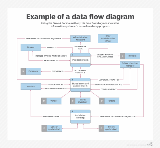
What are examples of DFDs?
The best examples of DFDs are provided in documents or tutorials relating to a singular methodology. Reviewing sample DFDs without the context of a methodology can make interpretation of the graphics and structure difficult.
Most DFD examples depict a business or functional view of a process, which is what distinguishes them from flow charts or UML that depict software flows or software architecture.
The image below is an example of a school's culinary program using the Gane and Sarson method.
What tools can be used to create a DFD?
While it's possible to draw DFDs by hand, it's rarely done except as an ad hoc aid to discussion. DFDs can be created using graphics or presentation tools, particularly those that support the creation of custom symbols. However, most DFD users find this limiting because of the common requirement of such tools to set a specific page size.
Most DFDs are created using specialized DFD tools, which are sometimes bundled with other features that relate to the specific methodology being used. There are many tools available, including both proprietary and open source. It's also possible to use cloud-hosted tools to create DFDs. Because many such tools are associated with a specific methodology, it's important to select a tool that fits the methodology to be used. Import and export functionality from one tool to another might be limited, so an enterprise should consider a standard tool.
Examples of DFD tools include the following:
- Canva.
- ConceptDraw.
- Creately.
- Lucidchart from Lucid Software Inc.
- Miro.
- SmartDraw.
- Venngage.
- Visual Paradigm.
- Wondershare EdrawMax from Edraw.
Benefits of DFDs
DFDs offer the following benefits:
- Improved clarity. A DFD provides an easy-to-understand visual representation of how data moves within a system or process.
- Enhanced understanding. A DFD's visual presentation of what's happening to data within a process promotes a deeper understanding of the process and can stimulate insights.
- Improved relationship between data assets. The identification of data storage resources, real-time and batch processes, and the integrations between them become more understandable in DFD format, making them easier to maintain.
- Troubleshooting. The DFD's visual explication of a process makes it easier to identify potential bottlenecks or other issues in a data flow.
- Enhanced documentation. Visual representations of the flow of data in systems or processes make it easier to communicate to others.
As a caveat, it should be noted that while the benefits of DFDs are important, they can be difficult to create and maintain.
Managing data and turning it into useful insight isn't easy. Learn the five key principles that are critical to helping resolve data challenges.